PIETER ENGELS 3 – 12 – 1938 29 – 3 – 2019
Pieter Engels was born in Rosmalen, his parents had moved there from The Hague. Engels’ father painted among his own art, Stations of the Cross and other religious scenes in churches and cathedrals, in the then still Catholic south there was more work for him. Engels’ interest was exclusively in sports, and that he would become an artist was not in the line of expectation. It was a sportsman who led him to become an artist. A boxer who was taking painting lessons from his father asked him to go outside with him one day to paint, gave him a sheet of paper and it happened, Pieter was instantly hooked.
In 1955, Engels was admitted to the Bossche Art Academy, then called the Royal School of Arts and Crafts. In December 1955, after the first report, Engels was called to the principal’s office for an interview.
He said, “we have talked about you for a long time but we think it would be better if you quit.”
Engels seems to have replied:
“No way, Bullshit, I’ll stay and become the best painter in the whole country.” And within a year he was the star of the school.
Whereas before he didn’t mix colors because it seemed terrible to him, he started doing the opposite and developed the most beautiful color combinations. In 1958 Engels went to the Rijksacademie in Amsterdam, which turned out to be a big disappointment. At that time the Rijksacademie was not yet a postgraduate, but a five-year academic free art course.
In comparison with the Bossche academy, where under the regime of Jan van Haaren, a cultural shift had just been made; in one week, one received as many as seven offers of what you could do with images. At the Rijksacademie, Engels had to draw naked ladies week in week out; he found it a corny institution. In that same year Engels competed for the Royal Grant for the free art of painting and won. Nineteen years old and had just started his propaedeutic year.
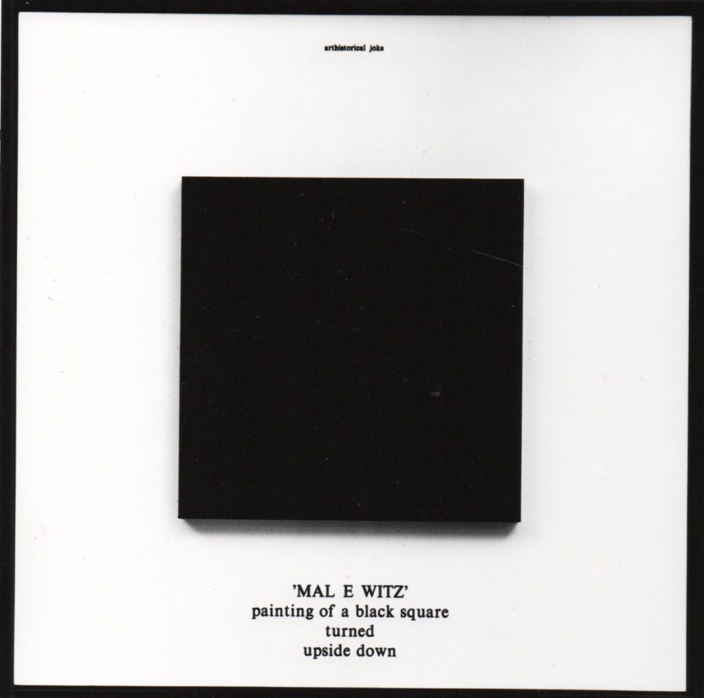
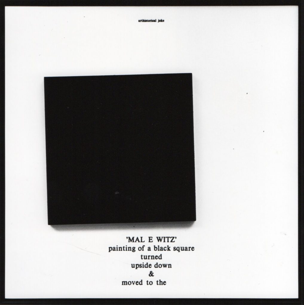
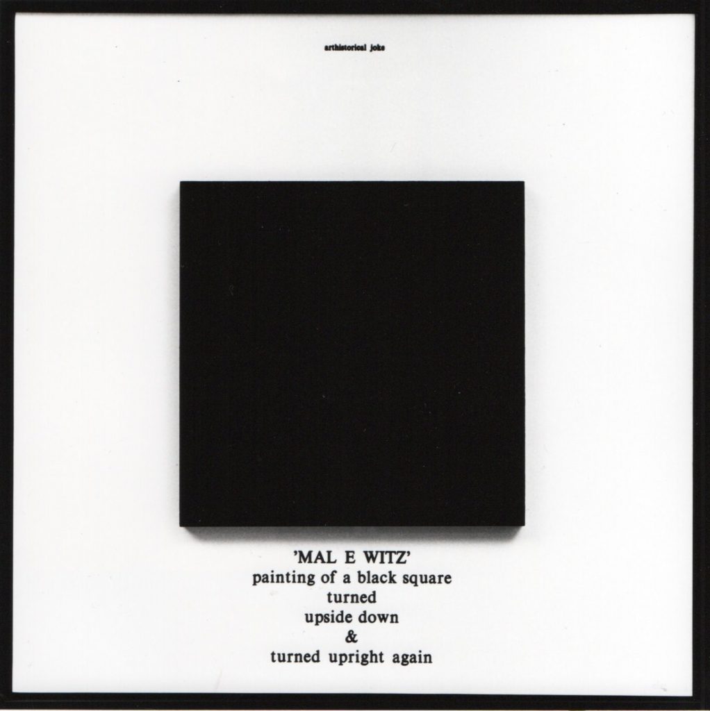
Again Engels was called to the director’s office, telling him not to start imagining things, he already looked so arrogant. His scholarship was halved from 100 to 50 guilders, the subsidy was then 1200 guilders. To keep his head above water, Engels stayed at the Rijksacademie for another three and a half years. by this time it was 1962, the 24-year-old Engels was living with his wife in a landlady’s house on Overtoom, a child was on the way, and money had to be earned. He had his studio at Wittenburg, near the central station. like all the other painters of his generation, he started out painting landscapes, still lifes and portraits. From there he worked towards abstractions until at one point he was into all-black monochrome paintings. People called this informal art at the time. For him, this was the end. To support the family he had all kinds of jobs, often heavy and dirty work, until he had enough of this too and decided that now he had to earn it with his own work.
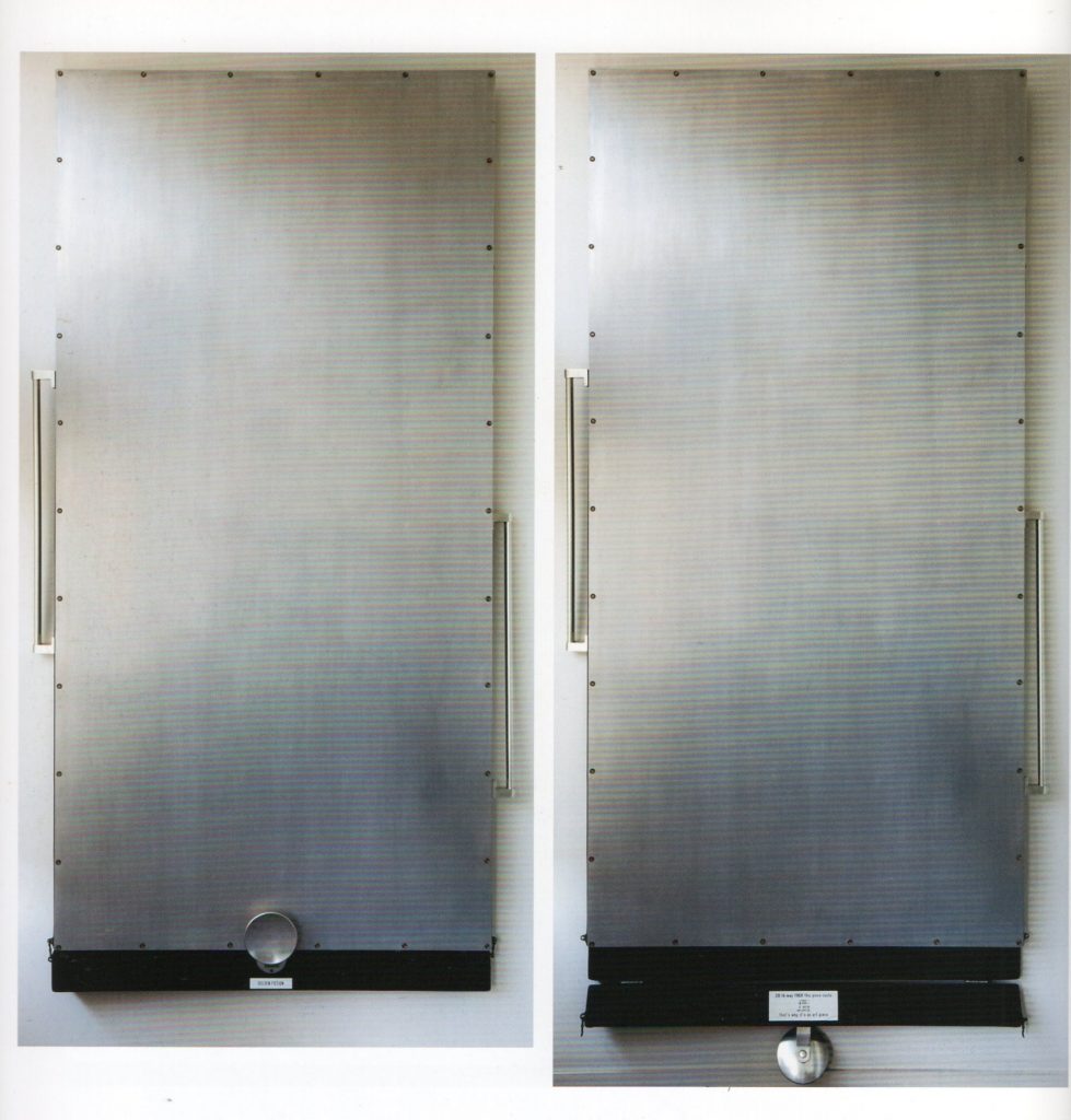
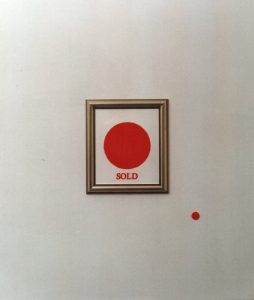
Pieter Engels, was the first Dutch artist to present himself as an entrepreneur, he founded the company EPO: Engels Products Organization. A company that made products instead of art. Products made of smooth, immaculate materials, reminiscent of the luxury decorative objects and utensils of the time.

The company and its products were marketed by means of leaflets, posters and flyers as was common practice in advertising. EPO was immediately picked up by the Dutch art world and became a successful company.
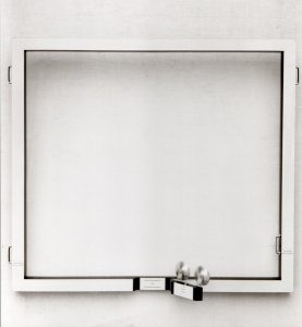
Typical EPO products are prototypes, restored furniture, assemblages, curtain pieces, girls coat pieces (1966) letter pieces and connection plates.

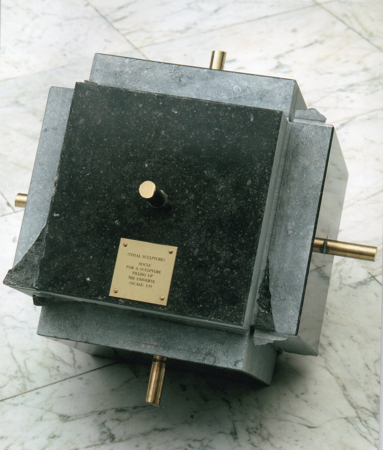
Some EPO key works from the late 1960s with art as their subject: Weight of a modern art piece(1968), A Modern Art Piece (Clothes of the Emporer) 1968. Golden Fiction(1968), Bad Constructed Canvas(1967, hommage a Engels).
With EPO, Pieter Engels, not only questioned the values of uniqueness and authenticity and the idea of art as individual expression, but also ironized the market mechanism of the art business.
Instead of a unique work of art, with a value that cannot be expressed in money, the work of art becomes a brand name article with the accompanying price tag.
Pieter Engels made the economic laws the subject of his art at a time when mentioning art and commerce in the same sentence was still taboo, in order to mercilessly expose the flat market mechanism in art. Looking at today, it is clear that art has not been able to escape the unrestrained power of the market and its ridiculous excesses.
An important position of Engels was, ‘Style as dogma is the vehicle of standstill. As a result, Engels didn’t just keep repeating the same trick, and soon founded another company: ENIO.
In 1967, after EPO, Engels founded his second institute: ENIO
ENIO, Engels New Interment Organization.
There is a connection between these two enterprises. In both, an elusive phenomenon is central, in one the art and in the other death, creation and death drive.
Although Engels’ offerings in the as always copious, ironically stated advertising texts with which he presented ENIO concerned primarily the burial of persons, for obvious reasons he had to limit himself in the work he executed to provisions for dead things such as ‘Coffin for 10.2 L of drowned water and
Coffin for a broken piece of wood.

Sometimes the sublimated aggression was not directed at the object itself but through the object at the audience, as in the electric suicide pieces from 1968. Art until death, suicide as a decadent pastime! The moral bankruptcy of art and the total failure of the art world as a whole!
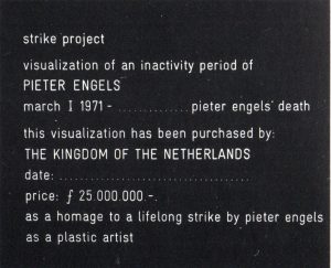
Then came ETI, Engels Third Institute for research in subcultural brainbuilding (1969).(research in subcultural brainbuilding). ETI, sold ideas instead of products. The most striking action he carried out for this institute is the Strike Project from 1971, in which he offered the Dutch state, through minister Marga Klompe, a lifelong strike as a visual artist in exchange for an amount of fl 25,000000.
here were also a number of visualizations of inactivity periods and denial projects(project for visible negation, place for no chair)and art-fiction(sky-event) and transfunctional projects.
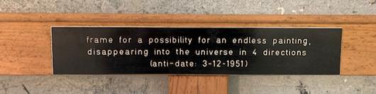
Anti-dating ( December 3, 1969 – December 3, 1970) Pieter Engels 31 years old, anti-dating 1951, Pieter Engels 13 years old. Pieter Engels, thus states that his thinking potential is predetermined and he can theoretically predict what kind of conclusions and (in)activities he will come to or will be able to come to.
In 1972 he releases the Double-EP: Engels fabulous oldest hits + oral signature.

GENESIS FOUNDATION
In 1974 Pieter Engels founds, Genesis Foundation of resurrection of art and down with mass-communication.
Here he distances himself from every anti-art and anti-anti-art movement. He refers to the fact that art is pre-eminently something that cannot be approached rationally. Anyone who does is not an artist. In this period he also has a number of projects in which he paints in the dark from various angles in order, among other things, to eliminate virtuosity, the choice of color etc. and composition, the brushstroke.
A Genesis project: painting-pieces for a painter, released from his handicap: his well trained eyes- or- unchecked and uncorrected images(executed in complete darkness).

BAMM
In 1976, Engels & Es founded, Brain Squad against mass communication and mediocrity,(BAMM). BAMM’s most important projects: Project Owlglass, and Es’ Worldwide wondering Gallery. Owlglass: Publication project against academism in the so called avangarde (minimal and conceptual art) artists and their critics. Owlglass consists of a series of 8 prints on poster size. These were distributed worldwide by The Worlwide Wandering Gallery van Es, among others.
PROJECT OWLGLASS 1975 -1977
Genesis Project: Engels’ Genesis Foundation, Engels’ fourth institute with the aim of: The Resurrection of art.
One of the threads running through the work of Pieter Engels is the questioning of image and writing – or rather, the undermining of dogmas, values, evaluations, laws and notions of style (in the narrower sense)
in the areas and fringes of contemporary visual art.
Owlgass was initially going to be shaped by means of purely linguistic publications, but eventually it became a combination of text and image, followed by a series of artworks.
The strength of Pieter Engels’ texts often lie in their ironizing, relativizing and perhaps badinage (yet paradoxically: with great seriousness), the visual work is often a combination of these elements with which he continually stimulates the dogmatic in the visual arts.
The 8 posters were sent in folded form worldwide by the worldwide wandering gallery of Simon Es ( Engels’ alter ego). All the posters sent were accompanied by a card, which the recipient could return with a comment or request to receive a signed deluxe copy for a fee of one hundred dollars.
1/ project ‘Owlglass’ TEMPORARY EVENT
aluminum text plates in the earth / large text plate: pricked text to appearances in current conceptual art, which Engels considers mediocre, stereotypical, not expressive and sleep-inducing.
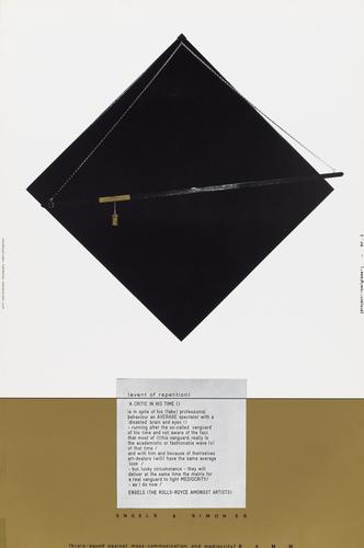
2/ project ‘Owlglass’ A CRITIC IN HIS TIME
aluminium text plate + an artwork that supports this text in its intention/
text plate: jab at art critics and art dealers, who despite a certain complacency ( ) or bias ( ), always turn out to be just average ( or – new academy ) viewers /
supporting artwork – simon es / ENGELS A GOLDEN BARD AMONST ARTIST OR A DISTURBER OF THE BALANCE OF MEDIOCRITY
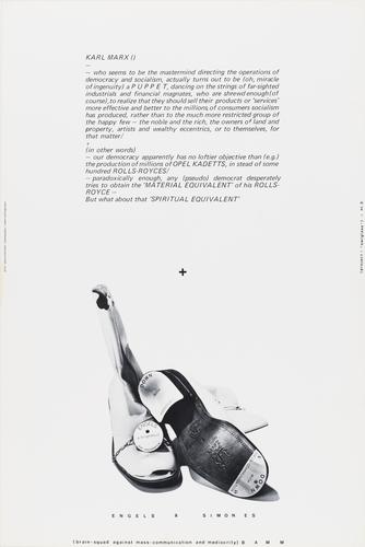
3/ project ‘Owlglass’ KARL MARX
aluminum text plate + supporting artwork /
text: poking fun at those who interpret democracy only in terms of the material /
supporting artwork – simon es / DOWN WITH MASS- COMMUNICATION DOWN WITH MEDIOCRITY
ENGLISH A BRIGHT FOOD PAR EXCEPTION
material: shoes – text image
materials: wood, velvet, copper and a gold bar.
4/ project ‘Owlglass’ ENGELS A MAGICIAN AMONGST ARTISTS OR A LONER WITHOUT A ‘CLAQUE’
image and text image /
image: a symbolic plea for the non-conformist among those artists who, because of their mentality, go through life (art) alone and perhaps because of that pure /
text image: a jab at those artists who conform for impure reasons /

5/ project ‘Owlglass’ ENGELS A ROSE ( AMONGST AN ARTIFICIAL BOUQEUT ) OR FADING ARTIST
image / text image / supporting artwork – simon es /
impact: similar to project 4
supporting artwork – simon es / visualization and alienation of the text / text image given
material / wood / velvet / photo / text image

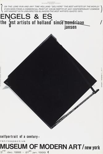
6/ project ‘Owlglass’ ENGELS & ES / THE BEST ARTISTS OF HOLLAND SINCE MONDRIAAN JANSEN
text + supporting artwork – simon es /
text: joking text to those who – as in every present time – are not aware of an art in their time and often propagate a contemporary academism ( ) unconsciously and are sensitive to all kinds of machinations of a mostly commercial art trade /
supporting artwork: – simon es/ enGLISH ‘KING UNUSUAL’OR NOT TO FRAME
again to encourage the non-conformist in his contradictory activities and who is careful not to be labeled / materials / velvet, wood, text image, plexiglass
7/ project ‘Owlglass’ DUCHAMP
text image: symbolic ‘obliteration of a big name, which continues to infiltrate an artist through established art authorities, moreover, an artist who has become wrapped up and academies / every artist – by definition vain – needs to see himself as great ( ) – if he is to continue to find his drive to start again and again /
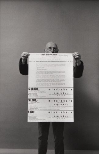
8/ project ‘Owlglass’ ENGLISH & ES MIND-SHARES
101 % mental profit
text image: gesture towards those who buy art as a material investment /
inversion: challenge to private investment in art or artist without material profit or noble gesture to the few among us who really strive throughout their lives to get the best out of themselves ( )
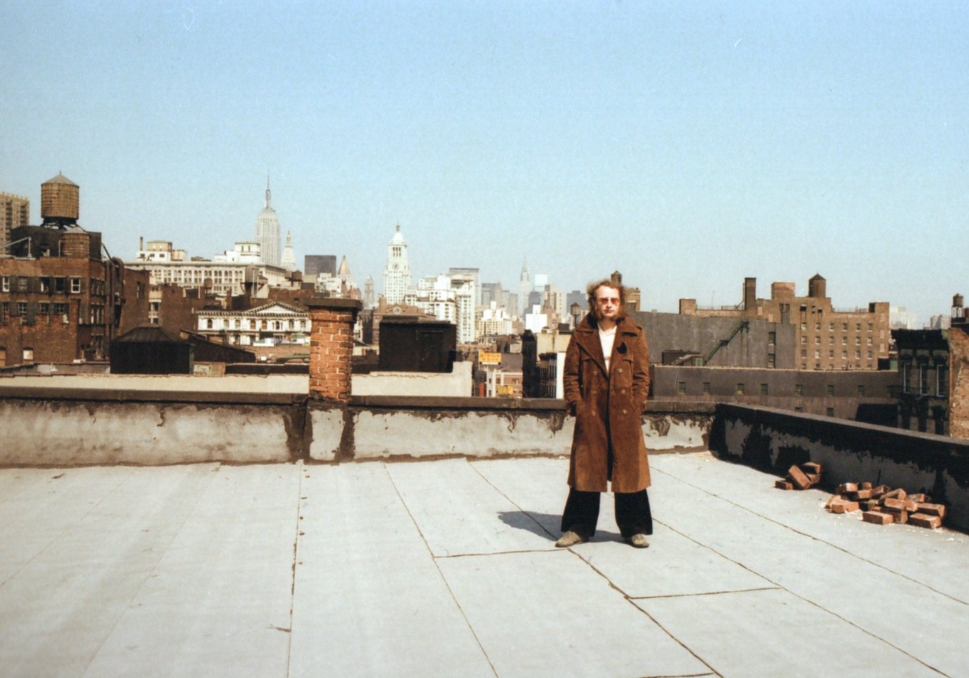
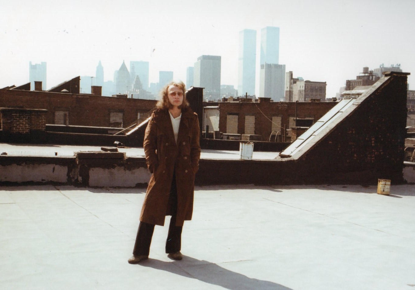
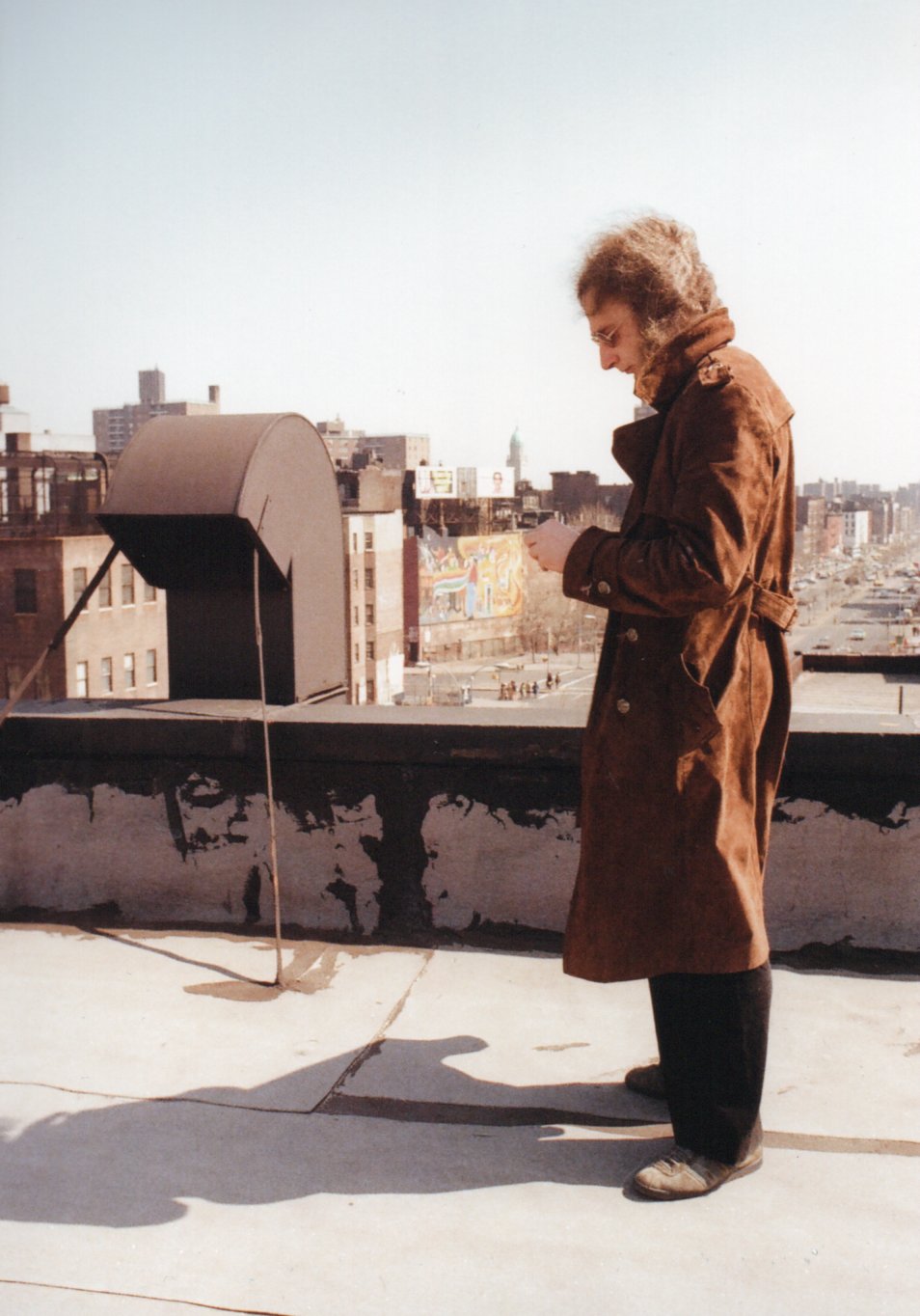
SEVENTIES NEW YORK
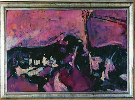
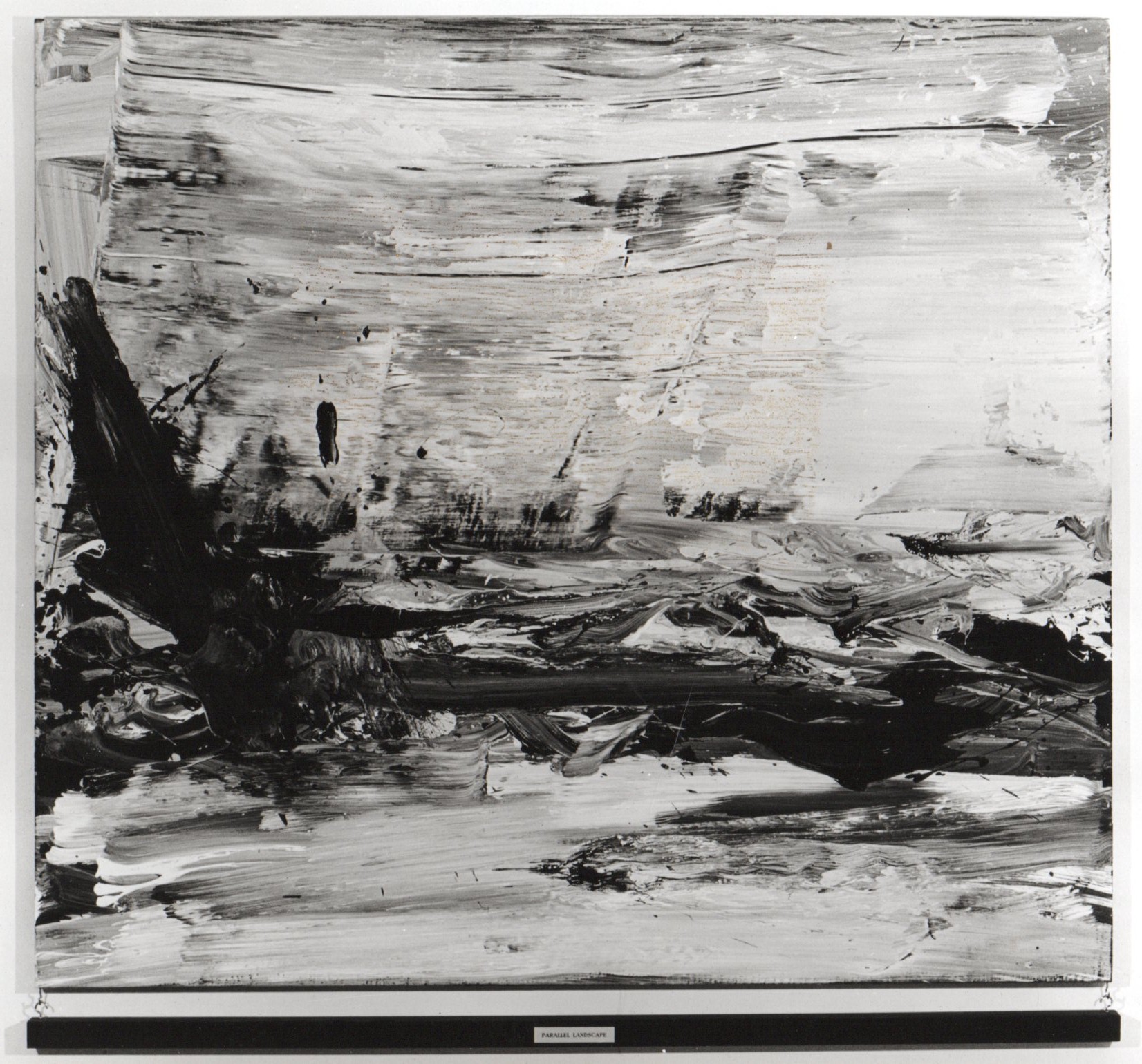
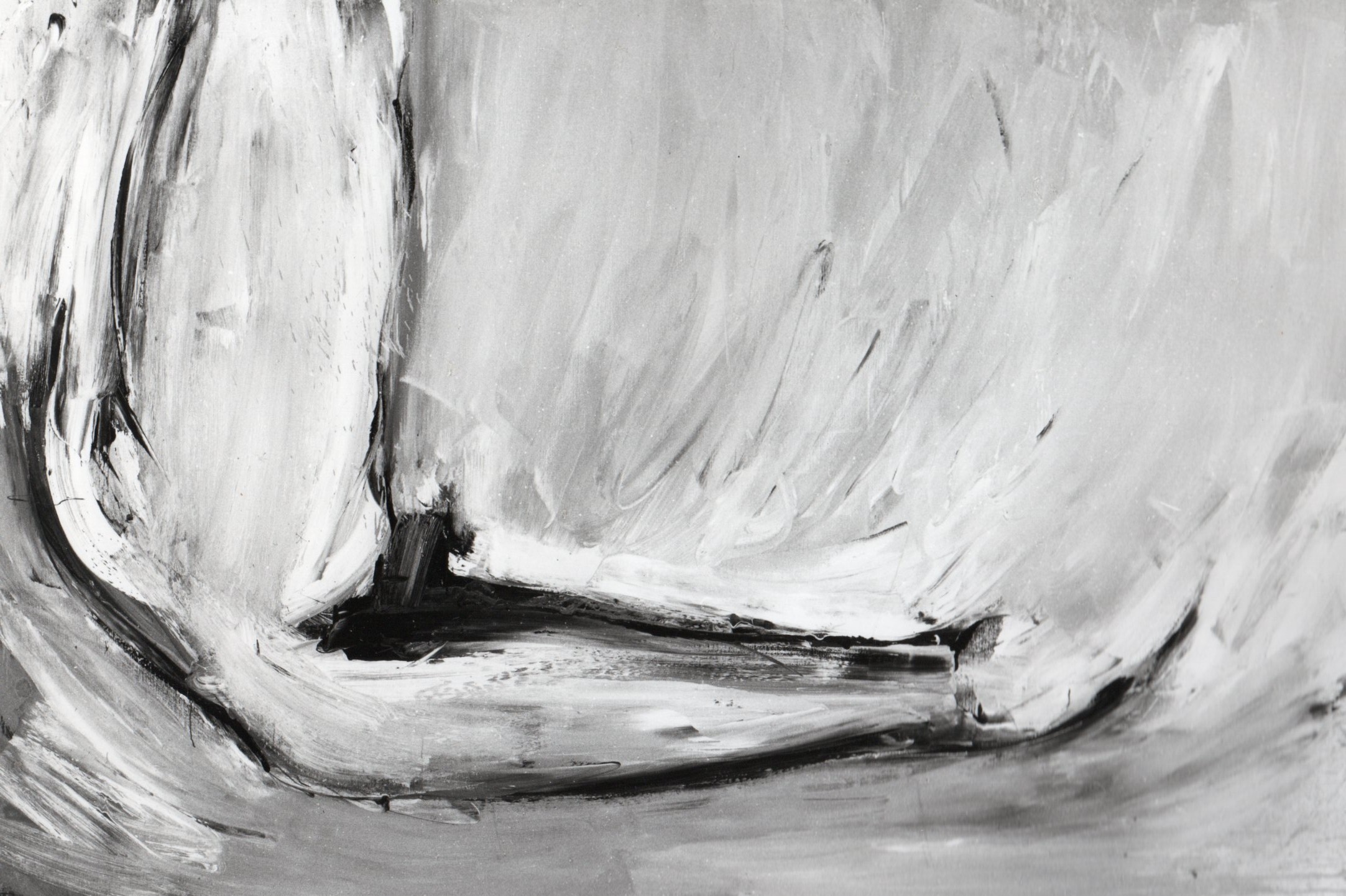
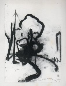
Paralellandscape 1980, series of landscapes in black and white because Engels was purely about the painterly actions derived from the movement of the landscape. Black and white is according to him a very pure form of expression, it is very minimal and therefore much more expressive. (He finds drawings e.g. by Rembrandt more exciting than his paintings).
The hanging beam emphasizes and kicks in an open door because a painted image of a landscape is not a landscape but a parallel reality of a landscape (a painted pipe is not a pipe, Magrite).
An essential part of my work is that I always involve the viewer (because without the viewer there is no work of art). By using text, among other things, I talk to the viewer, as it were. Such a bar with text gives the viewer something to hold on to or, on the contrary, he slips away. (Engels)
In 1981, Pieter Engels published Predicted Future Inventions, lithographs and text in collaboration with Gallerie Brinkman.
Among others, The selfhammering nail, Autoproductive machine.
Female landscape, 1982.
A series of paintings about the erotic movements of the female body.
INTRINSICAL ART WORKS 1983
Painted gold is more gold, a painted car is more car.

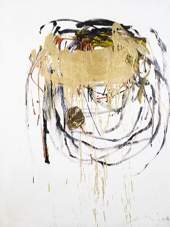
Gold as an introspective mirror 1984 – 1985
Paintings made with a gold blindfold and objects transformed into introspective objects encased in a gold blindfold.
juni 2008
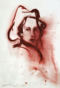
In recent years you make life-size paintings with no visual control over what you are doing. You make them with a golden blindfold on. You can tell from the titles of your works: ‘Blindgolded …’. As a subtitle you add: ‘Gold as an introspective mirror’. What vision underlies this?
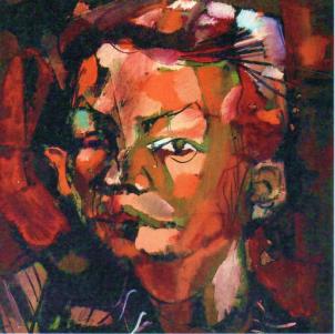
I created a series of self-portraits titled: “Blindgolded self-portrait.” I painted them blindfolded. For the blindfold I used textile with a gold surface.
For me, gold is the material with the greatest reflective ability. When I handle the gold as a mirror, it means that I am “looking inward. My eyes literally look into the gold, into the mirror, and so an image of introspection, of inward ‘gazing’ is created. This is how I created a number of paintings; first of all, of course, self-portraits. In an introspective way, I have thus created an image of myself.
That is, while painting you cannot judge whether you are doing well. Don’t you find that visual control a lack?
I find that control during painting is often unnecessary. It is usually a technical control of color, tone, composition, paint stroke and you name it. I want to eradicate all that so that I come to the pure act of painting itself!
Any excesses, any aspects of painting technique I cut away. Thus the pure act of painting remains. In 1974 – ’75 I used this method of painting before, although from a different perspective. I had painted my entire studio black; floors, walls and ceiling. The canvases I was working on I had also painted black. In that dark space, I began to paint on the black canvas. When I felt the painting should be finished I stopped. I turned on the light and was confronted with my own work as if it belonged to someone else. In this way I could see my own work as others, looking at it for the first time. Most artists work in a very different way. During their visual process, they constantly have to make decisions. And always that doubt about when to stop painting. On any canvas, you can keep working on it. It is never finished. When I stop, the painting is finished. Then I take off my golden blindfold and look. I don’t change anything more about it. The canvas must remain as I painted it at once.
Does it never happen that you scrape the paint off your canvas and use it again? Because you don’t like the painting anyway?
The curious thing about my paintings is that I feel they are always good. Of course, that has a lot to do with my views on technical craftsmanship in painting. I think you can put all the colors next to each other. Any composition to me is a good composition. People who are dismissive of that are caught up in their own dogmatism.
So you deny certain aesthetic dogmas?
Every form of aesthetics is based on conventions. You see that throughout the history of art. There are countless paintings that appeal to the taste of a particular time and are therefore time-bound. Painters abide by the rules of such a period, although with their own input, but the result is very much time-bound. This is how movements arise, and they are aesthetic by definition.
On the “Blindgolded… “canvases, multiple colors of paint are applied next to and over each other.
How do you do that when you can’t tell colors apart because you are blindfolded?
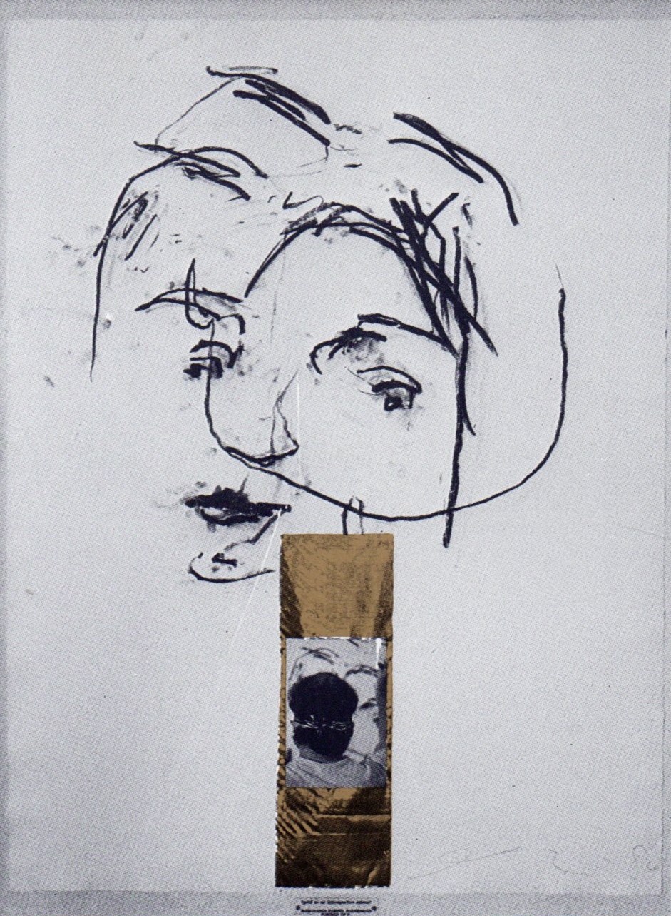
I do indeed work with three, four colors in those paintings. Usually primary colors like ultramarine or violet, red, yellow and white. So very direct colors. I put the paint on my palette and then I know approximately where the paint is, although I sometimes mistake myself. This is also how I worked on the “Blindgolded self-portrait.” A certain image of myself was created on the canvas. Not as I see my inner self, but a kind of visual image I have of myself. The picture and the golden rectangle, the blindfold, were added later. I cover the painting symbolically with gold; the painting also looks back into itself.
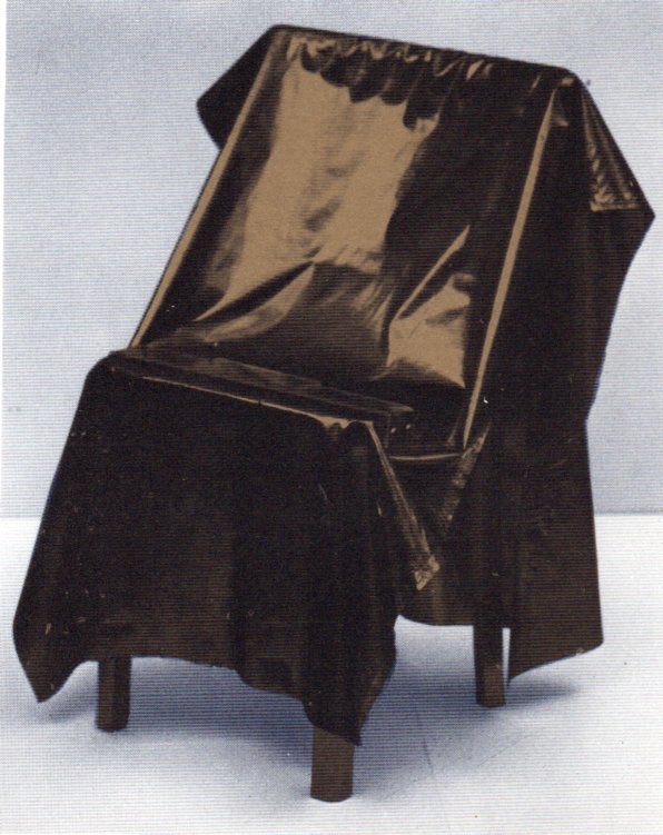
The photo in the painting where I am blindfolded , is one of a whole series, which a photographer took of me during my act of painting. With the “Blindgolded Chair” and the “Blindgolded Dollar” I do the same thing.
I make the dollar look shuttered in itself and so does the chair.
Why are you adding that picture?
That’s asked a lot. I haven’t quite figured that out myself. Maybe I want to provide evidence to a suspicious public.
By the way, the photograph is a very dramatic part of the painting. It evokes for me an association with a Japanese fighter, and that a painter should be a fighter everyone knows. That is actually the main meaning of the picture for me.
Doesn’t working blindfolded require more concentration than painting while seeing?
It is a very intense experience. When I still painted in a more normal way I never underwent it like that. It is also a very mysterious experience. I experienced it a few times that I didn’t really know what I was doing anymore. I couldn’t get to introspection; to inner images. I went on and after a few strokes I was so focused again that I could lift the essential out of myself. And as soon as I felt that , I knew it was good. I refer to the Far East when I say : “you must first become a mountain yourself in order to draw a mountain”. In my self-portraits, I had to find myself first before I could depict myself.
It seems like your compositions are based on certain rules, right? There is a lot of similarity in the construction of your paintings.
The canvases I use are two feet forty high. They are on the ground and I stand in front of them. I am right-handed so I paint more on the right side of the canvas. Because the canvas is so large I never get into the corners of the painting; I mainly work centrally. Large parts of the painting are left unpainted. The picture is added at the height of my head, since it is, after all, a picture of my painting blindfolded.
With your work “Blindgolded Chair” and “Blindgolded Dollar” you refer to the inner value of chair and dollar, by covering them with gold. How should I see that inward ‘gazing ‘?
By covering them with gold, I make them reflect in themselves. I actually personify these objects. By doing this I make a chair not be something , but someone. Of course, it gives a very strange image if you make a chair look like itself and even look into itself. That is the thought-jump I make; I give the chair a soul! I make it even stranger by painting the chair gold first, also from the viewpoint of using gold as a mirror. The gold chair looks into the gold canvas and vice versa. This creates a constant reflection.
Is there a relationship to Kosuth’s work? When he talks about a chair he puts up a real chair, hangs up a life-size photograph of a chair and adds a description from a dictionary or encyclopedia. The chair as a concept is thus called into question.
I think I go much further. A chair is often not a chair. A chair is a hammer when I handle it like a hammer. For example, I once made a drawing of a chair and later used it to hang the drawing. A chair is a chair when you use it as such. But you can also use it to light the fireplace. A chair is not a chair. It is an appointment. Of course, I also say when I see a chair: “that’s a chair”. But a chair is more than just a chair. I don’t go into the exact content of this chair-object. I find that I then disturb the viewer’s image. The same applies to “Blindgolded Dollar.” Only now it is about a concept of value, because the dollar is not a dollar but a representation of the abstract concept of dollar value.
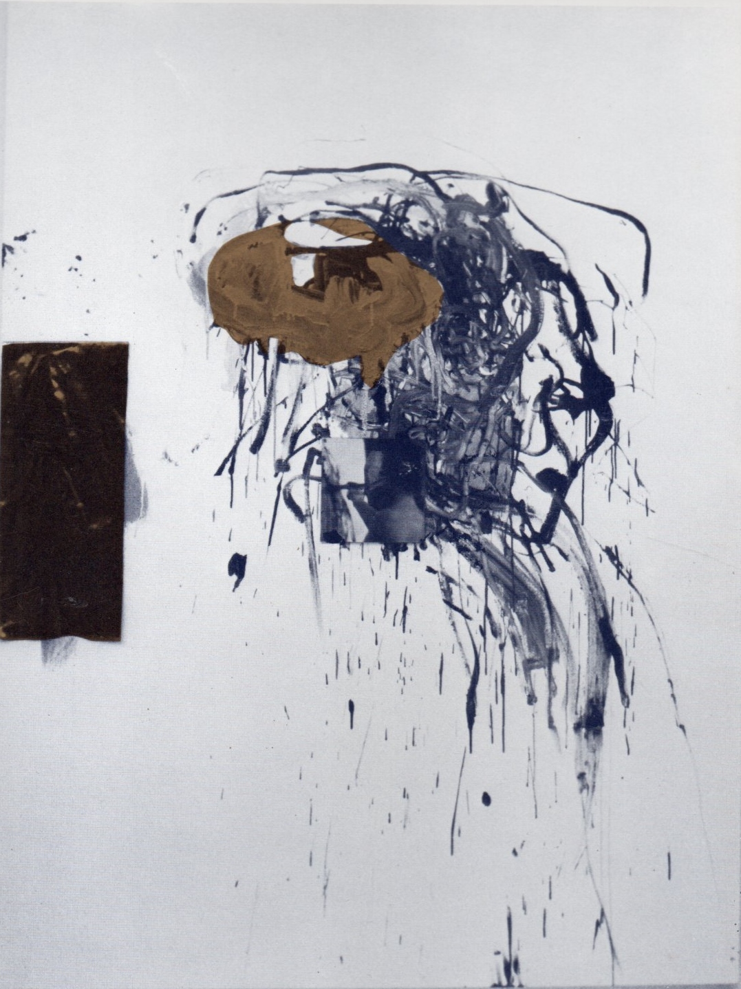
In Os, the painting ‘ God ‘ takes center stage. A 1985 work measuring 2.40 m high by 1.80 wide. The work belongs to a series of eight that were all painted blindfolded. In my opinion there are elements in it that are also present in the retrospective series. Would you like to comment on the content of this work?
The series ” God ” is in a way related to a number of works made before it. Incidentally, I feel the same way about it as I do about ” Blindgolded Chair ” and ” Dollar “. I wonder if I should say anything about it. If I bring out my reflections, there is a good chance that the public will not be sufficiently open to it; that viewing will be blocked. I do want to answer it in general. When you paint or make sculptures, you are actually seeking the impossible, the unattainable within yourself. I think this is the essence of what I want to say with these paintings. It is a search for ” God ” within yourself. I do not mean that in a religious way in the sense of Christianity or Islam. In my opinion it is a driving force for many, including non-artists. For me it is an invention because unattainable is translated into the concept of “God,” a concept I would normally never choose as a starting point for a painting. The most essential thing about the series ‘God ‘ is that it shows a search for the impossible. God is usually identified with a male figure. I wanted to turn that around and associate ‘God ‘ with an image of woman; the total woman, which we are also always searching for. The working method is as follows. First I paint a self-portrait on a small canvas; blindfolded. With the painted side facing forward, I place it in the center of the large painting. As if my painted portrait is looking into the window of the blank white canvas; as if it is looking into a universe. Then I take off the self-portrait and paint on the large canvas images of what for me is ‘ God’. Again with that golden blindfold on. When I think: ” God is there “, I take off my blindfold and look. Then I place the still wet self-portrait on the wet paint traces of ‘God’. And so it becomes, as it were, woven together.
You make the two paintings, the self-portrait and the large canvas, immediately after each other? Then you add letters: ‘G’, ‘O ‘, ‘D ‘. Is that to affirm the painting as a sign for ‘God ‘?
It’s very simple. It’s just the title of the work. By the way, at first I wanted to add to this series pictures of myself with the blindfold on, but later I took them out. You can see that the painting is also splattered with flecks of ultramarine and gold. After printing the self-portrait on the white canvas, I added those splashes. To evoke an overall view of the universe; it acts as a window to look into infinite space.
Now are you primarily a painter who seeks the pure act of painting or are you more in the realm of the conceptual artist. In the series ” Blindgolded “and “God ” both sides are equally represented.
For me this has always been a dilemma. It used to come up when I was only painting for a few years. I have to have a reason to paint; it should never be non-committal. Besides, I find painting itself very fascinating. Still, the meaning in the image is most important to me.
Your images seem purely personally intended. Do you think it is important for the public to understand your work?
I take the position that there is no painting without a viewer. I create the canvas, but the viewer completes it. In my opinion, that should be the view of every artist. Images focus on communication. I make windows; I put people on tracks that they themselves would not initially think of. That has always been a task of visual art, music or literature: to give people an uninformed view of what is happening around them or within them.
Piet Hagenaars, Museum Jan Cunen Os 1986 CONVERT THE IMAGE
1985 works about the universe and infinity.
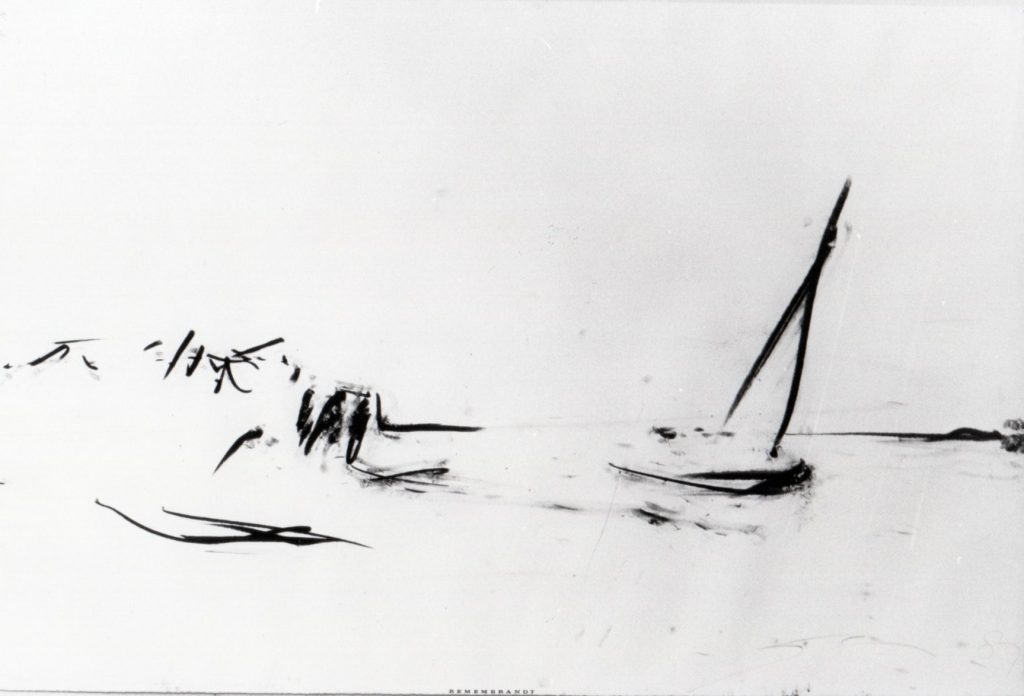
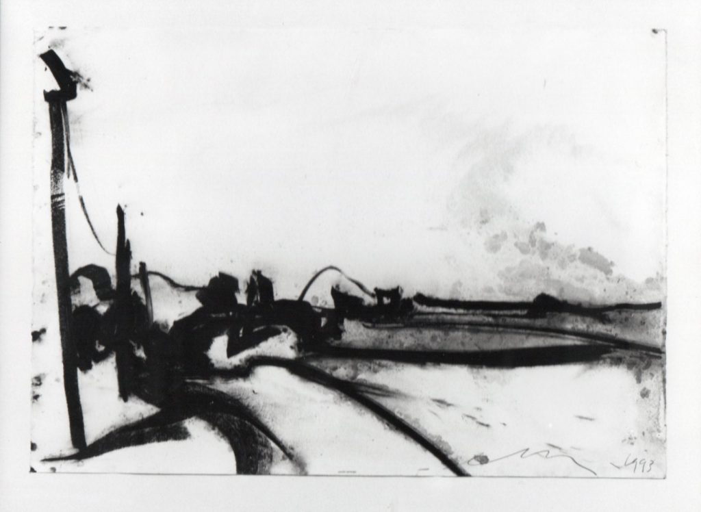
REMEMBRANDT 1987 – 1989
Remembrandt (ahead of the roots), drawings and paintings about Rembrandt as a paraphrase and as a tribute to the first painter who painted beyond painting and or the painting materials themselves.
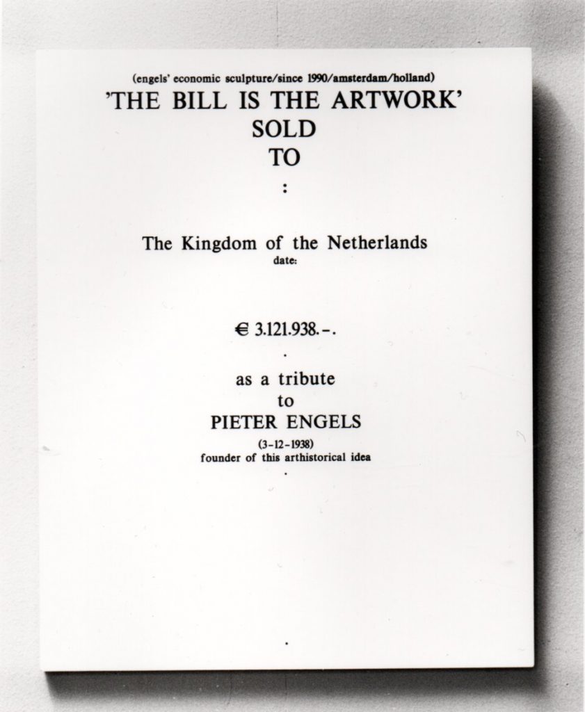
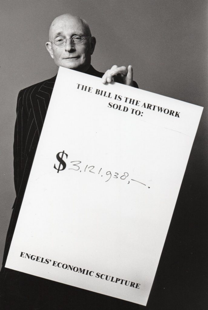
ECONOMIC SCULPTURES
(revaluation)
In 1989 Pieter Engels founded: Economic Sculptures(revaluation).
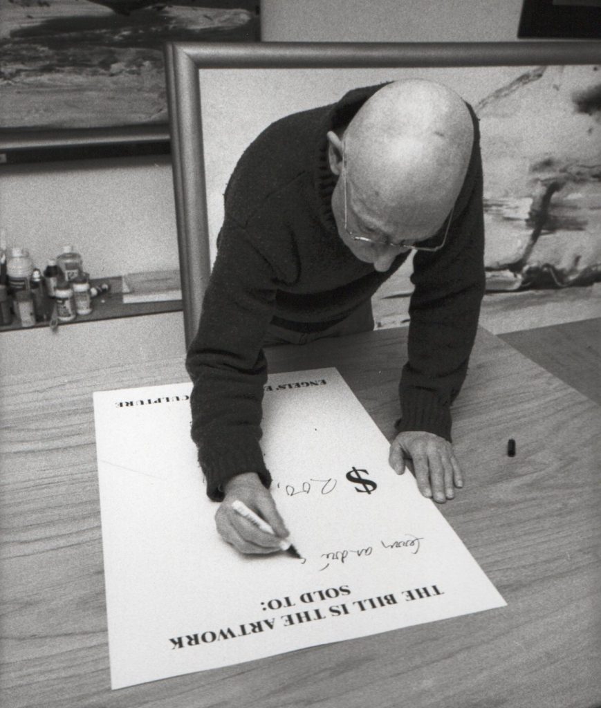
Just as with the work: Golden Fiction, an EPO product from 1968, soft mirrored aluminum plates with, underneath, on a hatch: on may 1968 this piece costs fl 4344,- $ 1200,- ₤ 502,92,- DM 4777,30,- Thats why it’s an art piece, it is not the artistic value that determines the economic value here but the other way around. Twenty-two years later, Engels says it again with his Economic Sculputers, in which sculpture refers not only to his own work but to the economy in its totality. They are assemblages of art painters and or sculpture materials and the receipts of the materials arranged. The prices of the artworks are the sum of those receipts, increased by a hefty mark-up. After all, this is about art.
Economic Sculpture 1990 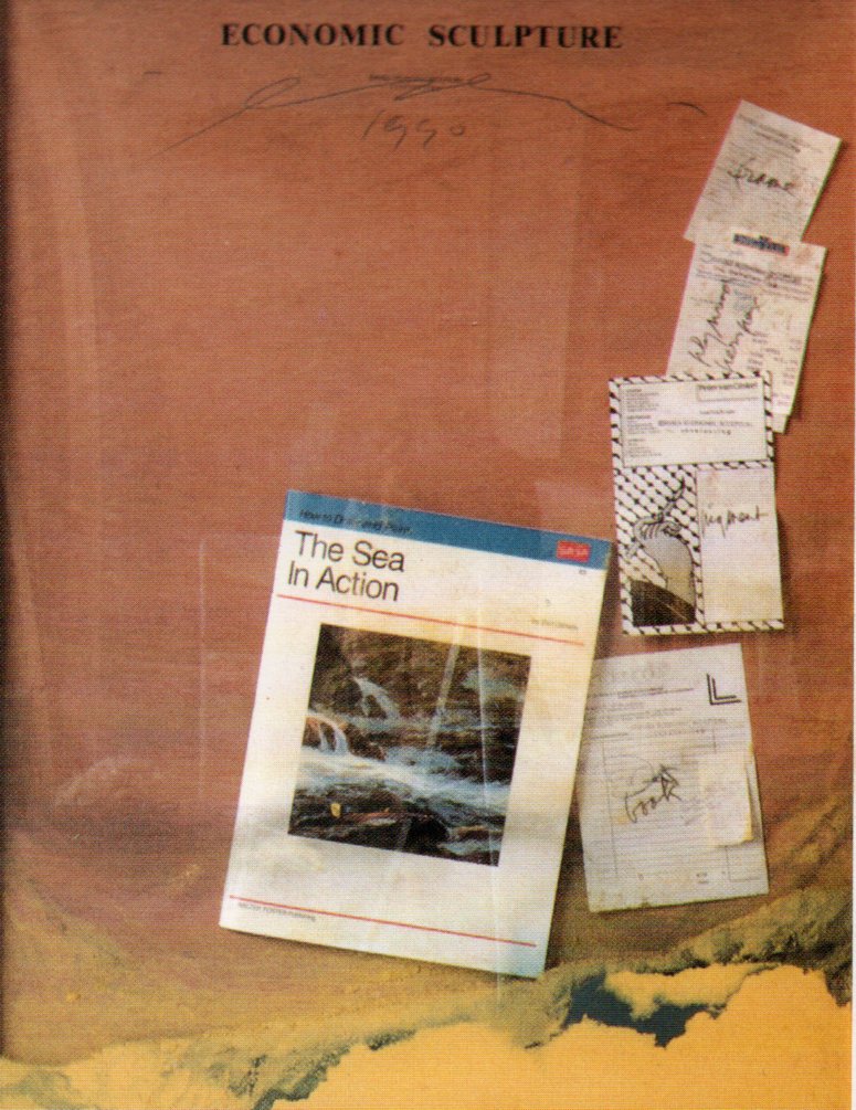
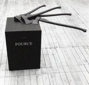
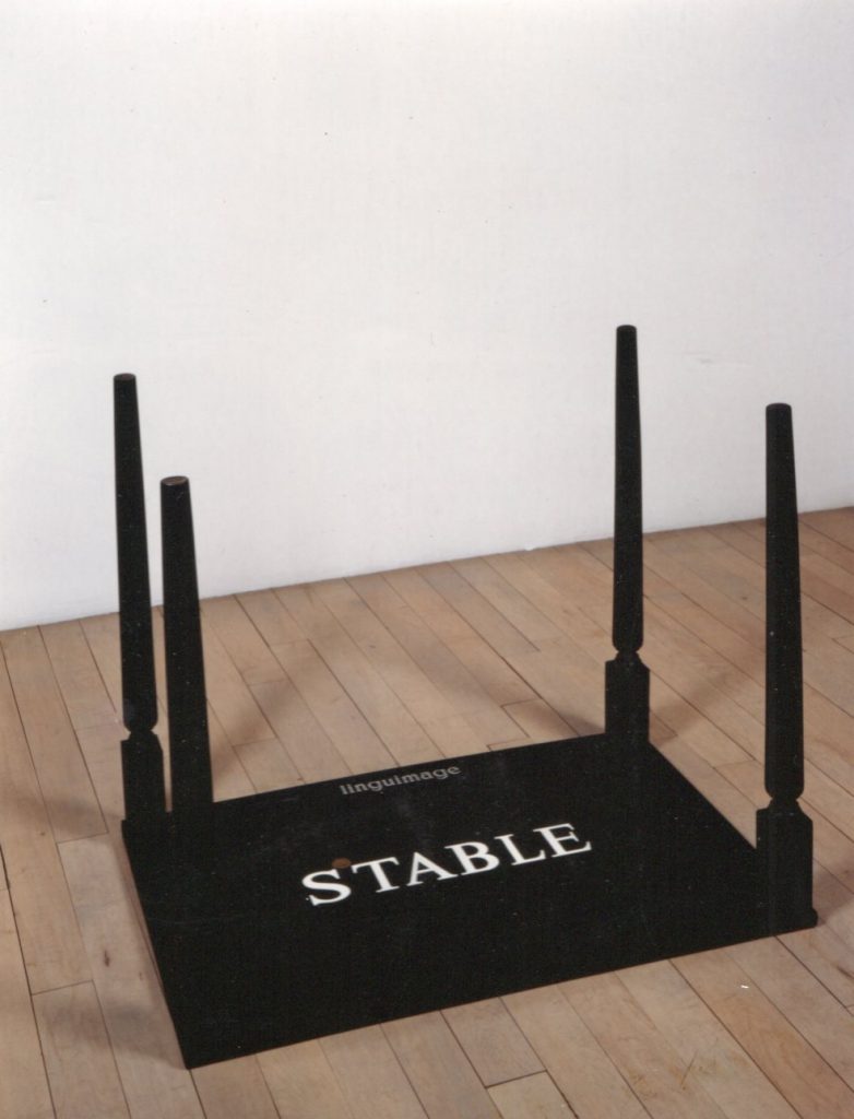
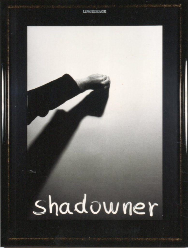
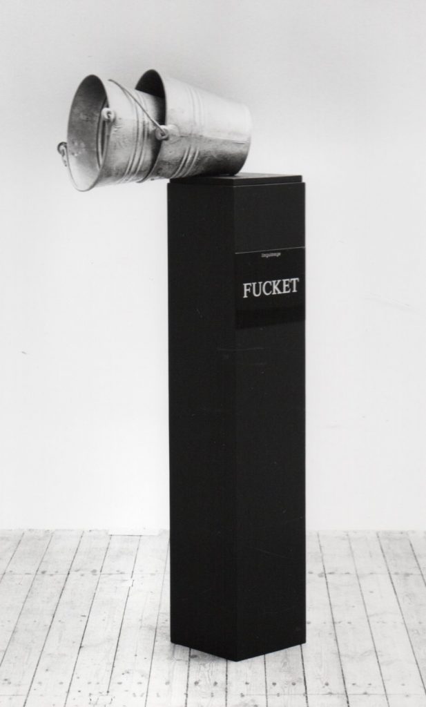
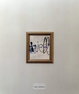
LINGUIMAGE 1991-1995
Linguimage are a series of works that are an amalgamation of language and image.
This is the third time Pieter Engels (Rosmalen 1938) has exhibited at Galerie van den Berg. In 1989 he showed the series ‘Remembrandts’, a number of landscapes based on Rembrandt. For this, the mainly conceptual artist Engels returned to paper and paint. The second exhibition, ‘Economic Sculptures’ in 1991, was mainly about the concept. Engels made collages of bills of material, a piece of wood, a bit of paint, a frame etc. The difference between cost price and actual price of the artwork is the value of Engels’ creativity.
The concept also plays a leading role in the current exhibition. Engels’ title is the self-devised word Linguimage, a combination of language and image. Twelve works are a visualization of ingenious, often witty wordplay. All works are executed in black and white, sometimes with a single golden accent. The first impression is one of a sober rather chic presentation. Each image contains a word puzzle. An example: four reclining swinging axes are attached to a column in which golden letters are chiseled the word ‘fource’. The strength of the axes and the number are reflected in that word. Another example: on a self-portrait of Engels he projects his head once more, which then becomes the work ‘Ahead’. I also find ‘Eraxeon’ very ingenious, in which the English word for axe and erection are combined. The accompanying image is a proudly upright axe. Perfectly made jokes, then. But sometimes also very worthwhile as an image. The fallen aluminum buckets on a deep black column, for example, make for a visually attractive composition. An exhibition that leaves you with a smile on your face. And the accompanying (high) prices…. Oh well, Engels has already shown how he calculates them.
Mary Winters 1992.
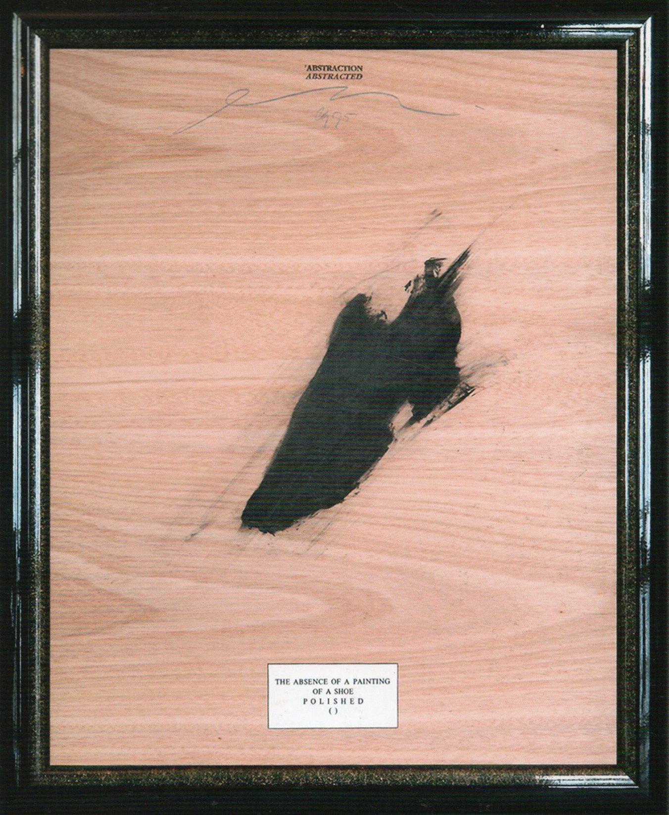
ABSTRACTION ABSTRACTED 1995
DOUBLE CROSSED 1996
Double crossed, a series of considerable size takes Engels further in playing with words.
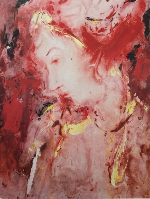
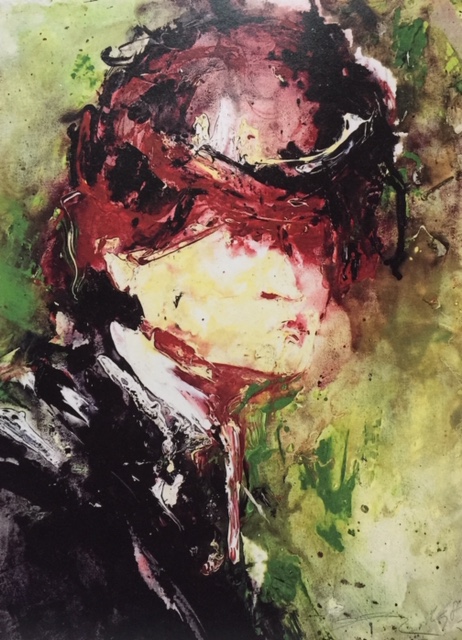
PORTRAITS AND LANDSCAPES 1998 – 2005
After a long period of illness: ART ABOUT ART 2009 – 2017
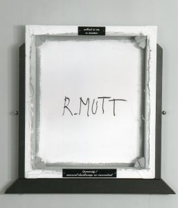
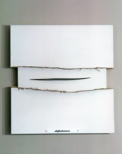
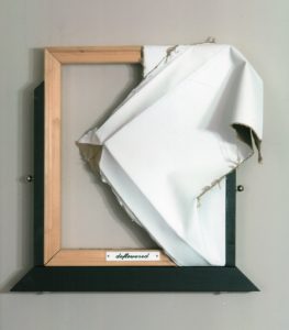
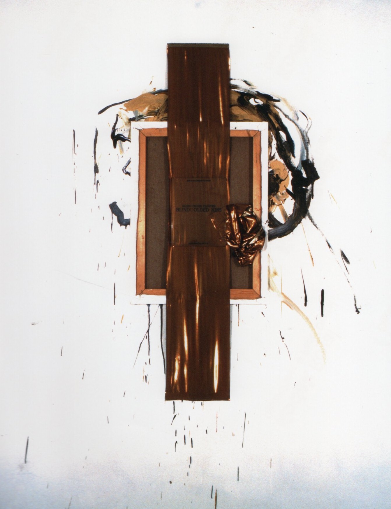
Whereas Engels previously denounced the art apparatus in a broader sense, in this series he refers to specific artists. In Defontanara he quoted Lucio Fontana (1899 – 1968), who like Engels made destruction the subject of his art, by making cuts in the canvas. But also Marcel Duchamp (1887 – 1968) was quoted in What is in a name R.MUTT (poverty) Marcel Duchamp re- invented (2010). R.MUTT is written in marker on the back of a canvas: the name with which Duchamp signed his famous urinal as early as 1917, Engels here associated with poverty, a phonetic translation of his name. It is possible that Ebgels was making a value judgment about Duchamp’s work here or that he was referring to the fact that Duchamp was also concerned with the economic aspects of art. (Fleur Junier,PIETER ENGELS the rrrolls – royce among artists, pag 39,40 )
DISTORTED VIEW 2016 -2017

WORKS ABOUT ENGELS 2016 – 2018

distorded square void hommage a engels 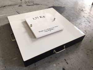
weight of a modern art piece 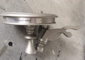
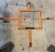
repaired table